Emerald Green Wedding Ideas: Palettes, Attire, and Decor
Plan an emerald green wedding with balanced color palettes, fabric comparisons, attire ideas, and practical tips for flowers, tables, and stationery.
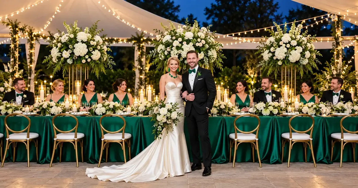
An emerald green wedding works best when you choose where the color will lead and where neutrals will give it space. Start with one palette, compare real fabric and paper samples, and repeat emerald in a few visible details. This guide shows how to coordinate attire, flowers, tables, and stationery without making every element green.
How Do You Style an Emerald Green Wedding?
- Choose an Emerald Green Wedding Palette.
- Adapt Emerald Green to the Season and Lighting.
- Coordinate Emerald Wedding Attire.
- Build a Balanced Ceremony and Reception Design.
- Connect Stationery, Desserts, and Photographs.
These images show styling ideas, not real weddings or products for sale. Share them with your vendors, then check which materials they can provide for your date.
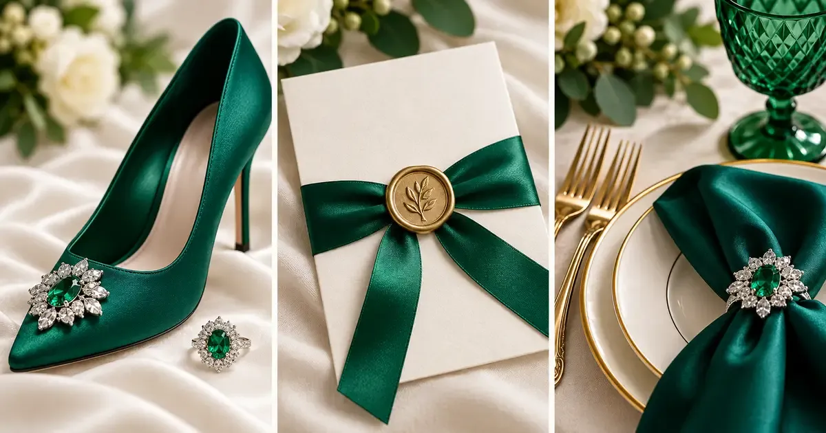
Styling example: Repeat emerald in an accessory, stationery detail, and place setting to connect the palette.
Choose an Emerald Green Wedding Palette
What Is the Difference Between Emerald and Sage Green?
Emerald green is a rich, saturated jewel tone, while sage is a softer, muted green. Emerald creates a stronger color statement; sage gives a quieter effect. For a wedding, compare physical swatches because suppliers use different shade names, and fabric finish can change how either green looks.
What Colors Go With Emerald Green for a Wedding?
Emerald green pairs with ivory and gold for a warm wedding palette, burgundy and black for a darker look, sage and wood for a softer setting, or navy and silver for cool contrast. Choose one supporting palette, then compare physical samples against your venue’s existing colors and lighting.
| Palette | Where to Use Emerald | Supporting Details | What to Watch |
|---|---|---|---|
| Emerald, gold, and ivory | Dresses or a statement linen | Ivory flowers, gold cutlery | Too many metallic surfaces can compete |
| Emerald, burgundy, and black | Napkins and selected flowers | Light plates or paper | Keep enough light contrast for details to read |
| Emerald, sage, and wood | Attire or stationery | Sage accents, exposed wood | Compare greens together before ordering |
| Emerald, navy, and silver | One main fabric and smaller accents | Silver candleholders, white flowers | Avoid covering every large surface in dark colors |
Compare Color Placement, Not Just Color Names
For emerald, gold, and ivory, try a light tabletop with green chair upholstery or napkins. Gold chargers can connect the place settings without turning every item metallic. The example below shows how an ivory base separates the green and gold elements.
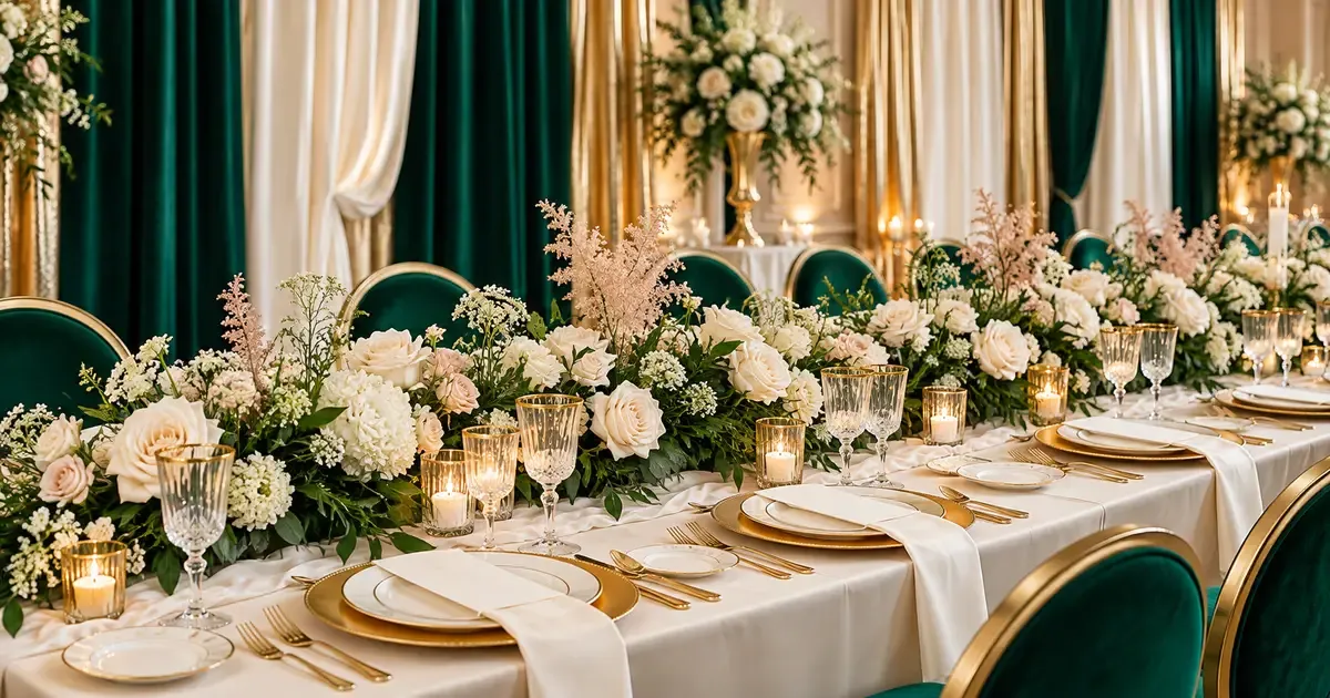
Styling example: An ivory base gives emerald chairs and gold tableware room to stand out.
For a darker palette, use burgundy as a smaller accent rather than a second dominant color. In the following example, compare the dark surfaces with the lighter flowers and tableware; that contrast is what keeps individual details visible.
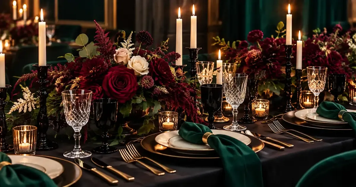
Styling example: Ivory plates and lighter blooms create contrast within an emerald, burgundy, and black palette.
For a softer setting, keep wooden surfaces visible and use sage as a supporting green. See Sage Green Wedding Ideas: Colors, Dresses and Decor Guide if you want to compare a muted green with emerald.
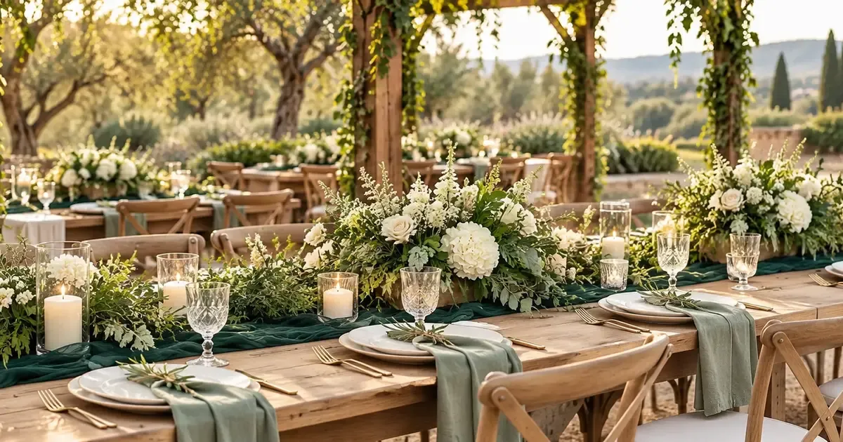
Styling example: Keep the wood visible and use sage napkins to soften an emerald runner.
Emerald and navy can work together when one leads. The next example uses white surfaces and silver details to separate the dark fabrics. Avoid selecting linens from screen images alone; place their samples together before committing.
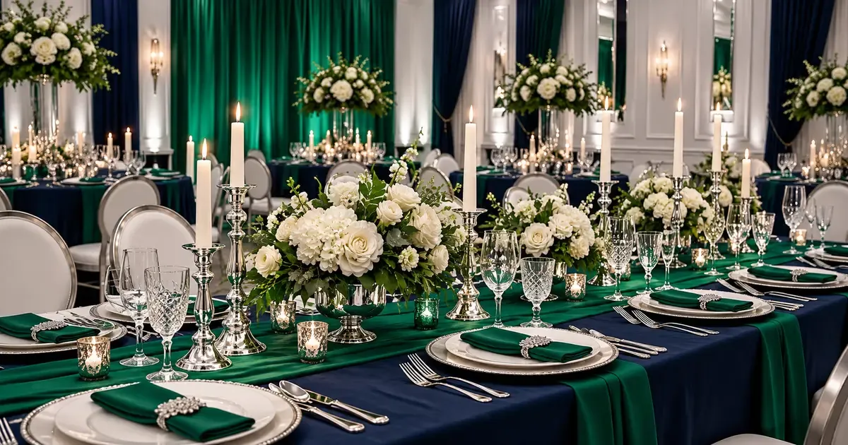
Styling example: White plates and silver accents separate the emerald and navy fabrics.
Adapt Emerald Green to the Season and Lighting
Can You Use Emerald Green for a Summer Wedding?
Yes, emerald green can work for a summer wedding. Pair it with ivory or white, use lighter fabrics, and reserve dark green for selected details such as dresses, napkins, or stationery. Check the actual garment’s lining and comfort, and view your fabric samples in daylight before ordering.
For spring, try blush accents; for fall, try burgundy or burnt orange. Burnt Orange Wedding Theme: Ideas for an Elegant Celebration offers another palette to compare. For winter, velvet and metallic details may suit an indoor evening reception, but consider the actual temperature and dress construction before choosing them.
Ask your florist which flowers are available locally for your date and what swaps they suggest. Seasonal inspiration lists do not guarantee availability or price.
Test Samples in the Actual Light
View your fabric sample in daylight and under the venue’s evening lighting. Glossy fabric can have bright highlights and dark folds. Matte fabric may look softer beside it. Take a reference photo, but approve the physical samples: screens and cameras can change how a shade looks.
Ask the lighting vendor to demonstrate colored uplighting before you book it. Emerald linens do not require green light across the room. Check that faces, flowers, and food still look natural, then agree on the lighting settings with your photographer and venue team.
Coordinate Emerald Wedding Attire
Choose Fabric Before Matching Every Outfit
Compare the finish and movement of fabrics as well as their shade. David’s Bridal’s emerald dress guide describes velvet as a richer option for cooler months and chiffon as a lighter styling direction. Use that as a starting point, then check the lining, fit, and comfort of the actual garment.
| Fabric | Visual Effect | Useful Styling Direction | Check Before Ordering |
|---|---|---|---|
| Satin | Glossy highlights and defined folds | Evening or formal attire | How shine changes the apparent shade |
| Chiffon | Soft movement and a lighter appearance | Outdoor or warm-weather styling | Lining, opacity, and comfort |
| Velvet | Textured surface with deep color | Cooler indoor celebrations | Weight, warmth, and shade changes with direction |
| Crepe | A quieter, less reflective finish | Simple silhouettes | Drape, lining, and the specific fabric blend |
For bridesmaid dresses, choose the supplier, shade, and fabric first. Then let attendants pick different necklines or sleeves. If you want mixed greens, compare the swatches together. Choose one shade to repeat in flowers or paper details.
Use Accessories for Smaller Color Commitments
An emerald shoe, sash, or piece of green jewelry can connect a white or ivory bridal outfit to the palette. Choose the detail you most want visible rather than adding all three automatically. The shoe-and-sash example shows two placements; you can use either on its own.
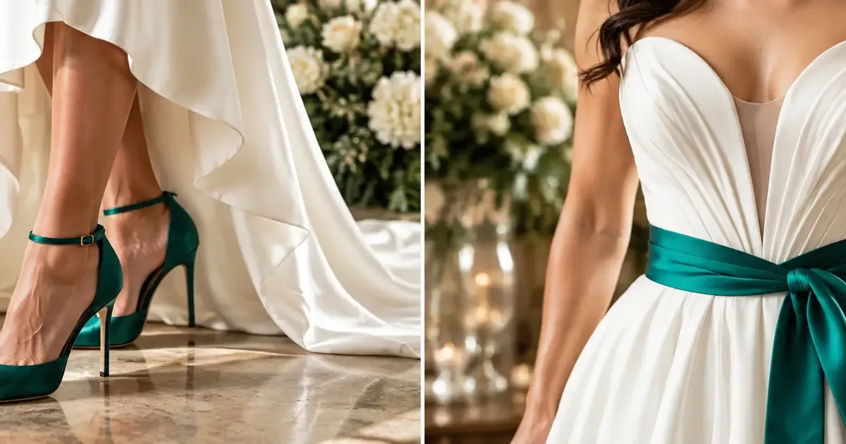
Styling example: Choose emerald heels, a sash, or both to bring the palette into an ivory bridal outfit.
An emerald tuxedo makes the color a major part of the ceremony photographs. A black or navy suit with a green tie or pocket square is a smaller commitment. Compare the outfit against the venue backdrop and your partner’s attire before selecting it.
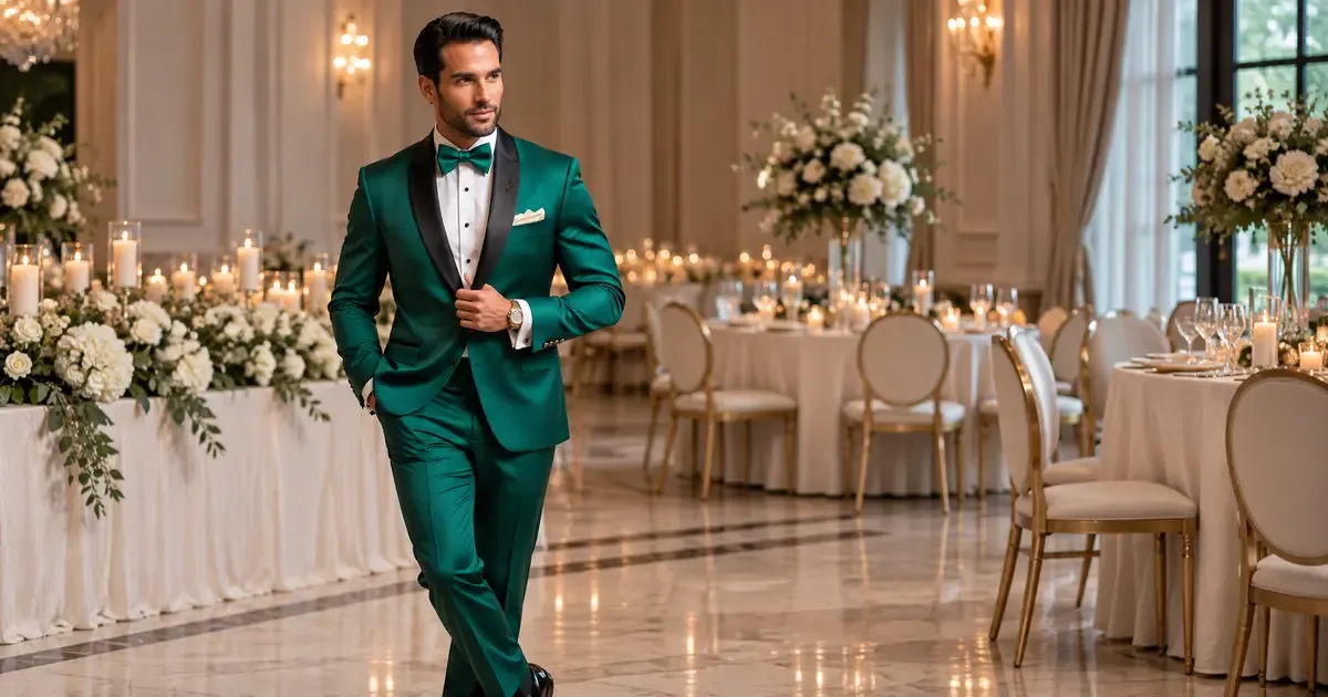
Styling example: An emerald tuxedo makes attire a focal point against a neutral setting.
Emerald is not guaranteed to suit every person’s preferences or every fabric equally. Invite attendants to try samples and choose comfortable cuts. The bridal-party example demonstrates coordinated color with varied dress styles, rather than requiring everyone to wear an identical outfit.
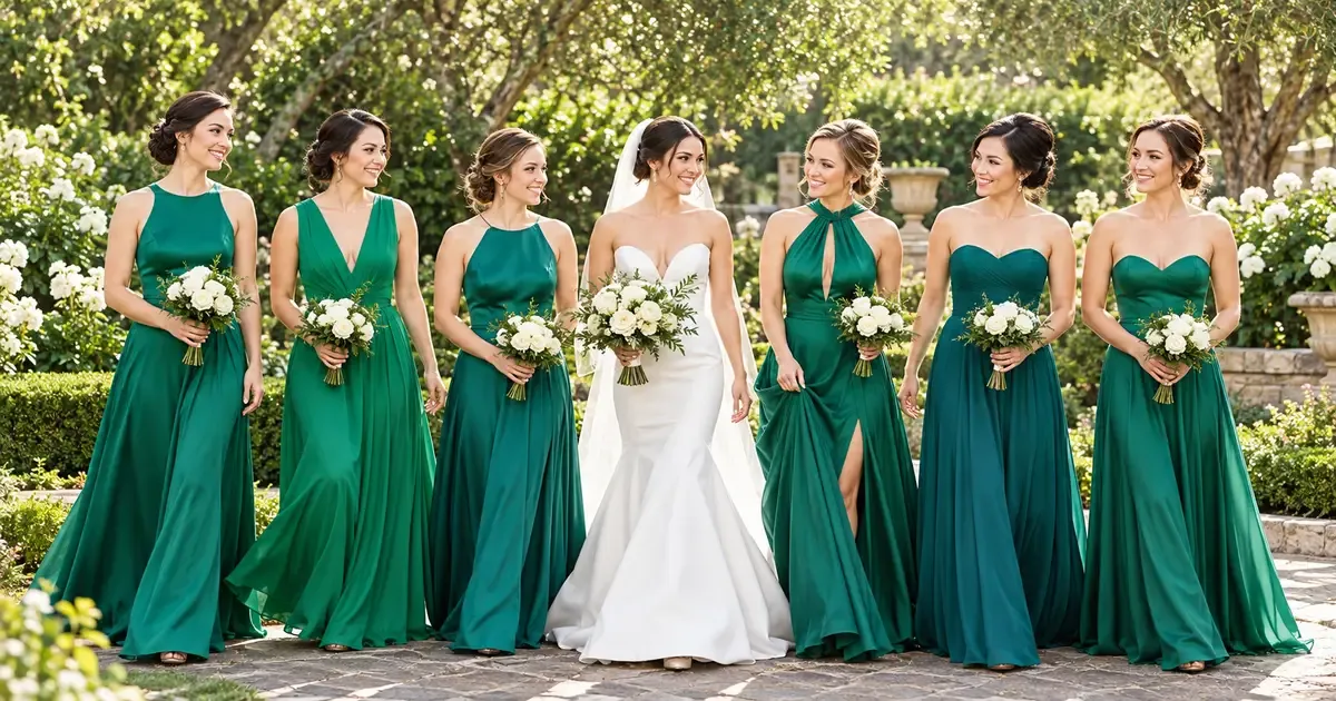
Styling example: A shared emerald shade ties together different bridesmaid dress styles.
Build a Balanced Ceremony and Reception Design
Give Emerald One Clear Role at Each Table
Start with the largest surface. If the tablecloth is emerald, try ivory napkins or plates. If the linen is ivory, green napkins or glassware can provide the main accent. One repeated choice across tables often creates a clearer result than several unrelated green items.
The place-setting example below shows the napkin as the focal color against lighter tableware. Use it to compare napkin texture, plate color, and metal finish before approving a rental order.
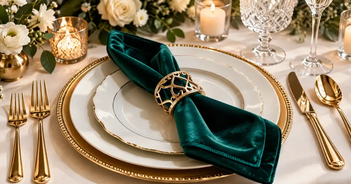
Styling example: Use a textured green napkin as the main color accent on a light place setting.
Ask for a sample table or assemble one with swatches and a plate. Check that guests can see across the centerpiece and that servers have space to place food. Confirm table dimensions, linen sizes, delivery, setup, and collection. Renting Wedding Décor: Costs, Rent vs Buy & Booking Checklist can help with those practical checks.
Coordinate Flowers and Ceremony Details
Natural greenery does not need to match dyed emerald fabric exactly. Ask your florist for a mix that complements the palette and suits the venue. White or ivory blooms can separate greenery from dark linens; a small burgundy accent can connect a moodier palette.
For the ceremony, choose one strong color placement, such as drapery, aisle details, or attendants’ outfits. Confirm installation rules before planning hanging fabric, arches, or candles. If arrangements will move to the reception, include the labor, transport, and timing in the quote.
Connect Stationery, Desserts, and Photographs
Repeat the Palette in Useful Details
Keep invitation text easy to read. An ivory card with emerald lettering or a green ribbon can express the palette without a dark background. Order a printed proof, check the contrast, and ask about postage for bulky seals or layered suites. This watercolor example offers a softer way to repeat green.
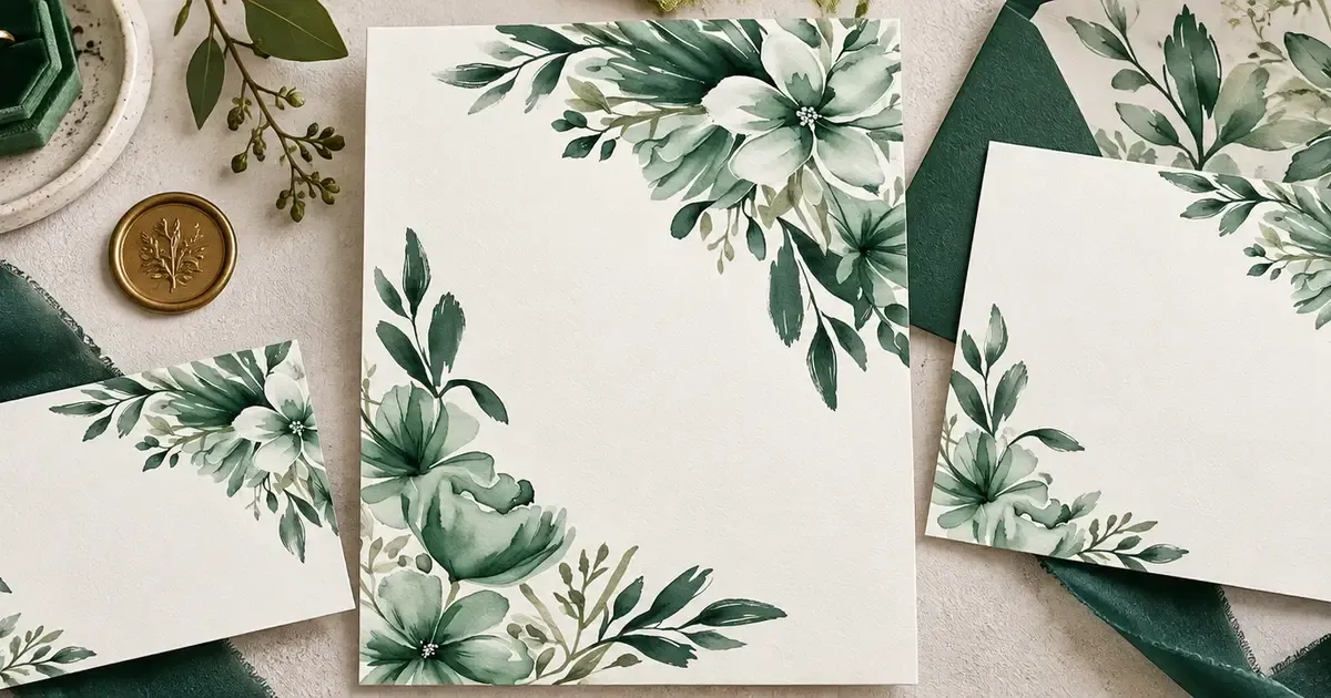
Styling example: Watercolor foliage and a ribbon carry the palette into an ivory stationery suite.
For dessert, choose a mostly white cake with green accents or a cake covered in emerald. Show your baker the example you prefer. Ask about the finish, taste, number of servings, and setup. Also check how the finish will hold up in your venue’s heat or humidity.
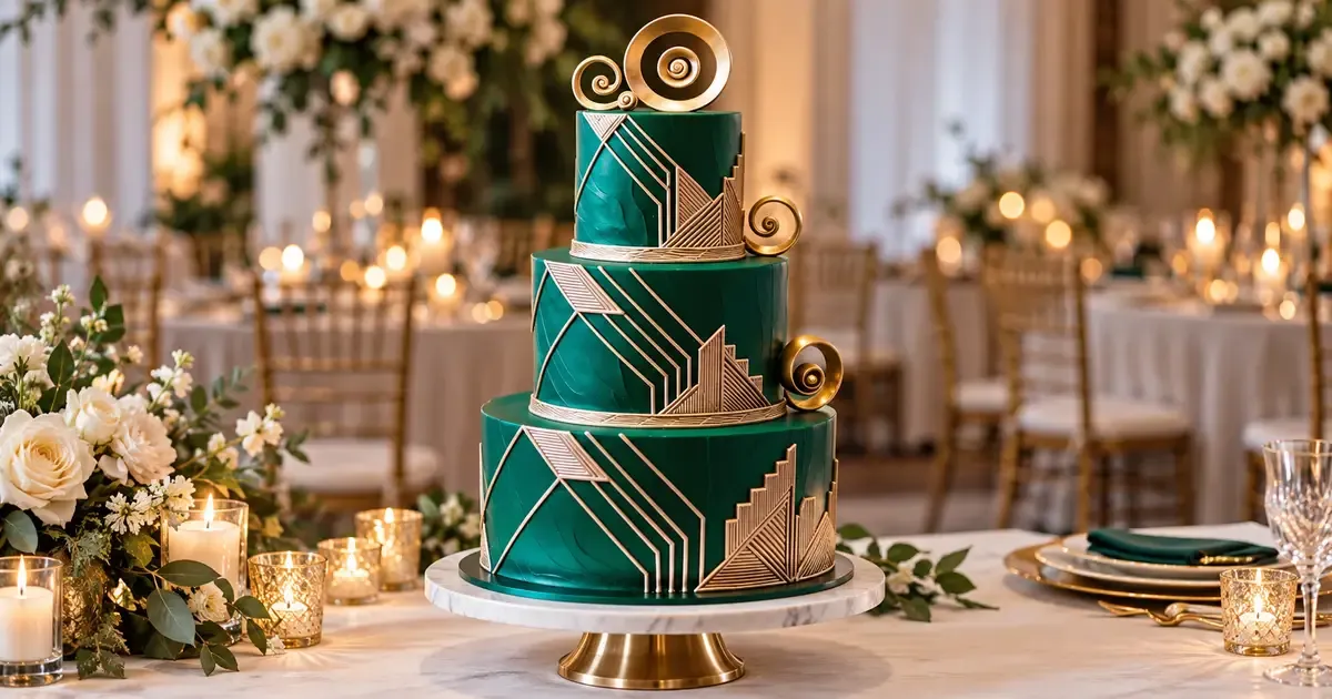
Styling example: Emerald fondant and restrained gold details make the cake a statement piece.
Favors are optional. If you include them, green wrapping or a fabric pouch can repeat the palette without adding another decorative installation. The pouch example shows packaging as the color accent; confirm the contents and cost before ordering.
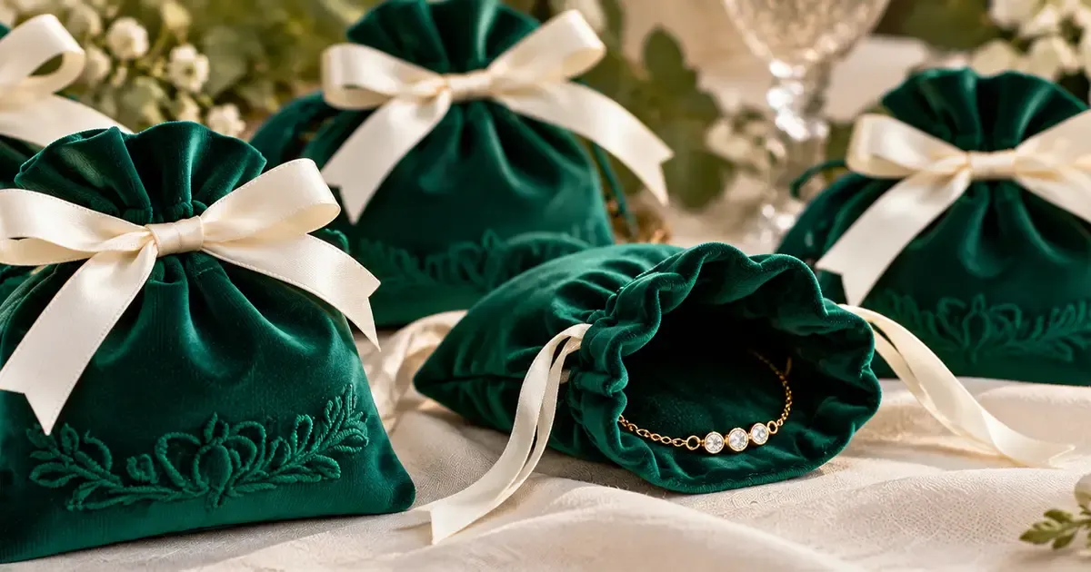
Styling example: Green packaging can repeat the palette without adding another large decoration.
Give Vendors One Shared Reference
The portrait example illustrates how a green outfit can sit against a garden backdrop. Ask your photographer to consider contrast and available light when choosing portrait locations. Share which details you want photographed, including accessories, paper goods, and the finished table setting.
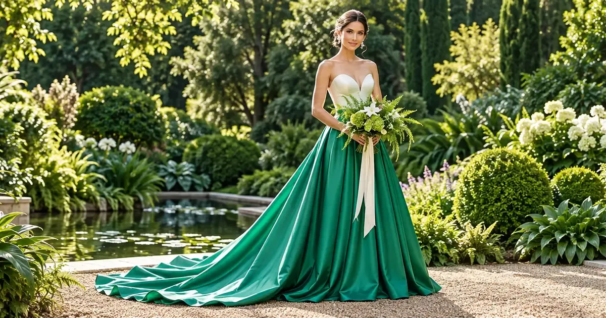
Styling example: Frame a green outfit against varied garden textures so its silhouette remains visible.
Put your approved swatches, palette, and images in one shared reference. Give each vendor the same version and mark the details you want to keep. Before placing final orders, check the dress fabric, rental counts, flower swaps, and printed paper proof. Agree on who handles setup. A few shared choices can tie the wedding together even when the greens vary.

Bridal by Bentley
Wedding Editorial
Bridal by Bentley publishes wedding inspiration and practical planning guides to help couples compare options and prepare for their celebrations.